pin it button

Showing posts with label Family Layouts. Show all posts

Monday, April 10, 2017

Family Layout and Some Technique Tips


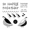
When I saw the darling April Stamp of the Month (Flock Together) I knew it would be perfect for a family layout. This is our daughter, Kori and her beautiful family.

I have some fun technique tips to share that I used on this layout, but first I want to remind you how you can get this stamp set.  It's only available in April and is yours for only $5 ($12.95 savings) with every $50 you purchase (before shipping and tax).  Purchase $100, get 2...and so on. When shopping on my website, you'll be prompted to add your set(s) before checking out.

Here are a few close up details of the layouts with some technique tips below.  Also, at the very end of this post, you'll find a products used list, complete with links and photos, for your shopping convenience.


  • Technique Tip #1:  Do you love the look of a large scalloped square under the focal point of a layout (see top left and bottom right photos in the photo collage above)? I do!  But, I don't always love lugging my Cricut out to cut one, nor do I want to search the local craft store to find a pre-cut one.  I have the perfect solution....a CIRCLE PUNCH!  WOO HOO! I used the 1" circle punch from Close To My Heart to punch White Daisy Cardstock circles then adhered them under that focal point square with about 1/2 of them hiding underneath so that you just see the scallops poking out.  Easy, peasy and so cute!
  • Technique Tip #2:  I really wanted a touch of red on this layout. I  added a few hearts stamped in Cranberry ink, but I wanted a red border too. I didn't want to add any more bulk to my layout, so instead of adding another layer of cardstock, I drew a double border with a ruler and journaling pen, then filled that in with my Shin Han Carmine Alcohol Marker. You can see this in the top right photo.
  • Technique Tip #3:  One of my very favorite looks is White Embossing on colored cardstock. I think  it's such a beautiful look, easy to do, but one we forget about.  I used this technique on the title. I just embossed the words in white on Peacock Cardstock, dovetailed the ends, and my title was ready! Fun!  BONUS TIP: Did you notice that I stamped the title with the words all in a row, instead of stacked like you see it in the photo of the stamp set?  That's easy to do! Just take your scissors and carefully cut the words apart. Then you can put them onto your stamp black however you choose...all lined up, or stacked. Cool beans!
  • Technique Tip #4:  Pop it!  I used two different thicknesses of 3D Foam Tape on this layout, the regular and the thin. I love the dimension popping a few things gives a card or layout, and by using a few different thicknesses, you can add even more dimension.  I used Thin 3D Foam Tape under the title strip, and Regular 3D Foam Tape under some of the quail and hearts.
  • Technique Tip #5:  Don't forget that adding a little shimmer can be just the perfect touch. I used my handy dandy Clear Shimmer Brush to add some shimmer to each of the quail and to each of the Cranberry stamped hearts (see top left corner photo).  Love that look! 


Monday, September 5, 2016

Blessed Beyond Measure Layout and Colored Pencil Shading Tips


I was looking through some of my mom's photo albums last month and ran across this gem.  Are you kidding me?  This was way back in 1996. How did I not have a copy of this photo. I pulled out my trusty cell phone and snapped a photo of the photo, uploaded it to my computer, did a little editing, then printed that baby out.  Of course, it's not nearly the quality of the original (which was glued down and was not coming up to scan), but I'm so glad I have it. Since then, as I've showed this pic to some friends, I've heard this comment several times, "You guys look like an 90's sitcom family in this photo!"  I'm not sure if that's a compliment of not.  (lol).

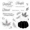
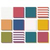
I used the September Stamp of the Month (Blessed Beyond Measure) as my accent on this layout (the title and the pumpkin) and used papers from the new Enchantment Fundamentals pack for most of the background and the little flags along the side of the photo.  I've included a full list of the products I used, complete with photos and links for your convenience, at the end of this post.


Remember that this stamp set is only available in September and is yours for only $5 ($12.95 savings) with every $50 you order. Order $100, get 2...and so on. When ordering on my website, you'll be prompted to add your set(s) before checking out.

Here are a few close ups of the layout.  The first shows the flags I used down the side of my photo.  along with papers from the Enchantment Fundamentals pack, I also used some of the stamps from the Stamp of the Month to stamp tone-on-tone designs on some cardstock.


In this photo, you can see the close up of the pumpkin, which I stamped in Goldrush ink then used my watercolor pencils (without water) to shade on top.  I will give you a little detailed photo of how to do that below.  Another fun detail this photo shows is that on the "word search" paper from the Enchantment Fundamentals pack, there really are fun words to find and circle, which is a nice touch on this layout.  I just chose a few words that I thought went with my layout and circled them with my journaling pen.


Colored pencil shading on solid stamping:


Steps to shading on solid stamped images with colored pencils:

1. Stamp your solid stamp. In this case that is the pumpkin design. I stamped it in Goldrush ink (first pumpkin).

2.  Pick a colored pencil just slightly darker than the base ink color and shade.

A few tips:
  • take your pencil on a scratch piece of paper and rub it at an angle. This will make a nice angled flat tip on your pencil. This will make your shading much smoother than using a point to color.
  • start at the place you want to be the darkest on your shading and press the hardest with your pencil. Go back and forth along the length of what you are shading.  As you move in, put a little less pressure on your pencil so the shading gets lighter and lighter and blends with the base ink color.
3.  Once you are happy with your first pencil shading, feel free to find a darker color and do a little more shading at the places you want to be the very darkest. I used 2 colors of pencils on this pumpkin.

Have fun stamping and shading!


LinkWithin

Related Posts with Thumbnails