pin it button

Showing posts with label Masculine Layout. Show all posts

Monday, May 8, 2017

Masculine Layout with the May Stamp of the Month


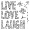
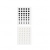
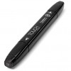
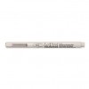
When I saw the May Stamp of the Month, I immediately thought of this awesome picture of our son, Dawson laughing.  The only thing is, the letters in the May Stamp of the Month are filled with flowers.  That's a GOOD thing in most cases, but not this one. I wanted the "LAUGH" letters, but not with the flowers inside for this layout.  So, since necessity is the mother of invention, I decided to pull out my Black Shin Han Marker and color in the letters once I stamped them. I then used my Gold Metallic Marker to add polka dots, then added an outline with my Journaling Pen.  VOILA!  Floral "LAUGH" is now polka dotted "LAUGH," and is now perfect for this layout.  I used papers from our brand new Jack Paper Packet (LOVE!!!!) and the matching Jack Complements as my accents.  I have included a list of all of the products I used on this layout, complete with photos and links for your convenience, at the end of this post.


I'll  share a few more details about this layout in just a jiffy, but first I wanted to be sure you knew how to get this awesome stamp set.  It's yours in May only for $5 ($12.95 savings) with each $50 in product you purchase (before shipping and tax).  Order $100, get 2...and so on. When ordering on my website, you'll be prompted to add your set(s) before checking out.  Easy, peasy!


Now, here are a few details of the layout:


Wednesday, May 3, 2017

Boy Layout with our Street


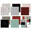
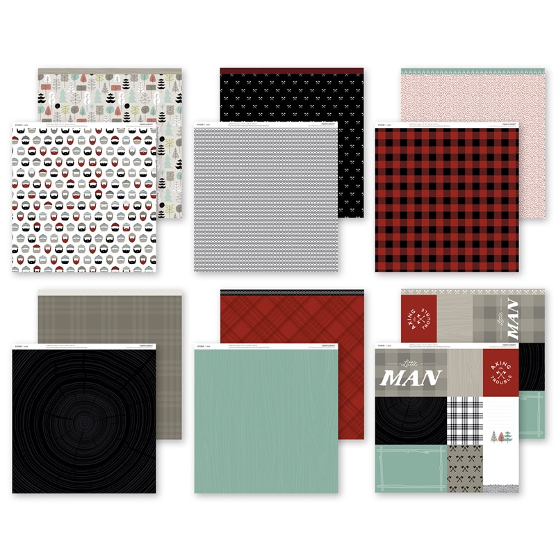
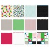
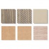
How about the papers on this awesome layout?  Aren't they spectacular?  When I saw the "Jack" Paper Packet and matching Complements in our new mini-catalog (Expressions 2), I knew they would be perfect for photos of boys, and I was right (I love it when I'm right! 😉O). Don't these photos of our grandson, Street look amazing on this paper?

Here are a few detail shots:

Now, let's talk about this awesome Paper Packet and matching Complements.

Jack Paper Packet - $9.95 (includes 2 each of 6 double sided designs).
product image
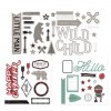
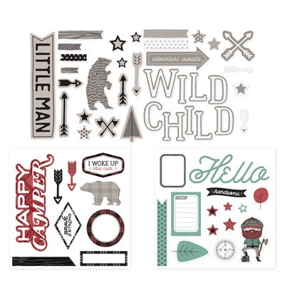
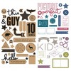
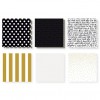
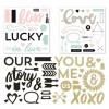
Jack Complements - Coordinating stickers and chipboard die-cuts, including some with white foil or black foil

Stop by my website to see all of the fun new products today!


Monday, March 13, 2017

You're My Cup Of Tea Masculine Layout


Since Tannon was born, he has nickname after nickname.  It started with Tan-Man, the went to T-Man, then just T,  then TP, and now it's #teeps.  Hilarious.  When I saw this fun tea cup stamp set, I knew right away that it would be perfect for a layout of Tannon documenting his nicknames.

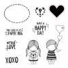
This stamp set is only available in March, and is only $5 ($12.95 savings) with every $50 you order (before shipping and tax).  Order $100, get 2...and so on. When ordering on my website, you'll be prompted to add your set(s) before checking out.  TEA-rrific! I've also included a list of the products I used on this layout, complete with photos and links to those products, for your convenience at the end of this post.

One fun technique that I used on this layout was printing the same photo in different hues.  Do you ever have a single photo you love but you aren't sure you want to do another single photo layout (I have tons of them)? Sometimes it's fun to print the same photo in color, black and white, sepia, and maybe even an antique filter.  Just mix them up and use them on the same page. Fun stuff!

I kept this layout quite neutral with lots of white space. I really love that look. I think it makes the photos really pop, don't you?  I shaded my tea cup with watercolor paints, and for just a hint of pattern, I used the very neutral Whisper Grey triangles on a white background patterned paper from the Some Kinda Wonderful Paper Packet underneath my "T".  This paper packet is full of bright colors and bold patterns, so this soft spoken pattern is a fun surprise in there. The black and white "railroad ties" pattern that I used for the banner strip in the upper left hand corner is also from this paper packet.


Wednesday, August 17, 2016

It's All About the Polka Dots Layout


This little grandson guy never ceases to bring a smile to my face. In fact, yesterday as I was watching him while his big sister, Livvi was at chemo with her mom and dad, we were watching the Olympics together. I'm telling you, this little 14 1/2 month old was into it!  We were watching the men's 200 meter qualifying heats and whenever they got into the starting blocks he would yell, "GO!" So cute.

Anyway, back to the artwork.  This layout showcases both the Rustic Home and Uptown Fundamentals paper packs. All I added was a bit of Poppy Cardstock, Black Cardstock and White Daisy Cardstock.  This month, when you purchase the Whimsy, Adventure and Enchantment Fundamentals packs, you get to choose either the Rustic Home or the Uptown pack for FREE!  You can do this easily, with one little click here.

The little detail I wanted to point out on this layout is the Poppy Cardstock polka dots. The black and white polka dot print paper is from the Uptown Fundamentals pack.  When creating this layout I thought it would be cute to add a few Poppy polka dots to tie in the accent color I used on this layout. The polka dots on the paper are just larger than 1/2" so I pulled out my 1/2" punch and punched a few Poppy Cardstock circles and added them strategically to the layout.  I love that they are just a tad but smaller than the white ones printed on the paper because it makes for a nice little edge around the Poppy ones.  It was a simple but fun way to add a bit of color detail to this layout. 

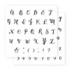
I used my Tuxedo Black stamp pad and  trusty watercolor paints and brushes to create the little boy and balloons from the True Love Stamp Set (you can find this set on the back cover of our Annual Inspirations Idea Book. It is the set that is dedicated to helping Operation Smile. When you purchase this set, $7 of your purchase price goes straight to Operation Smile!).  And, how about that dreamy font I used for Stade's name? I'll bet you thought I hand lettered it. NOPE!  It is a brand new alphabet stamp set called Bistro Script that has become one of my new obsessions.  Tip: when stamping this alphabet, you won't want to line those letters up on a long block. I suggest you stamp them one at a time so it's easy to connect them and make it look like it's hand lettered.  Easy, peasy, but it makes all the difference! Also, notice the wood grain on the brown paper is actually embossed. Fancy, schmancy!  I didn't emboss it. It came that way in the Rustic Home Fundamentals paper pack. Yes, please!


Here's another fun tip.When using twine, tie your knot and then take your piercing tool (I think it should be called the pokey tool because I use it for so much more than piercing) and with the pokey end, carefully unwind the twine ends. It creates a fun, frayed look.  I do it all the time and I love that look.


Never fear! I have included a handy list of all the products I used on this layout, complete with links and photos at the very end of this post. 


LinkWithin

Related Posts with Thumbnails