Wednesday, August 3, 2016
Fear the Beard Layout
Have you noticed the awesome August special with Close To My Heart? It's called 'Basically the Best,' well, because it IS! Let's talk about how it works. We have LOTS of new paper packs (with matching accessories) called FUNDAMENTALS. They're called that because they are basic and FUN!
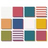
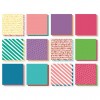
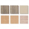
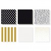
In August, when you purchase one each of the Whimsy, Adventure and Enchantment Fundamentals paper packs, you get your choice of either the Rustic Home or Uptown Fundamentals paper pack for FREE! Yep, for realsies...FREE! Let me show you the papers, then I'll tell you some details about the layout of our son, Tannon above. This layout actually features 4 of these fundamentals paper packs. I've used papers from Adventure (the purple and turquoise banner strips), Enchantment (the Goldrush grid paper, and the green and maroon banner strips), Rustic Home (the weathered wood paper and the polka dotted kraft binner strip) and Uptown (the black and white polka dot banner strip). How's that for being versatile paper that's fun to mix and match? The only pack that's part of the special that I didn't use something from on this layout is the Whimsy collection. Never fear...you'll see some using that as the month progresses!
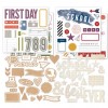
Here are images of the Whimsy, Adventure and Enchantment paper packets, as well as the Rustic Home and Uptown paper packets that you can choose for FREE this month! Just click here for easy, one click shopping for this special.
Now, let's get back to that fun layout. Not only did I enjoy creating by mixing my FUNdamentals (see what I did there?), but I created a hidden pocket for journaling. See that big Goldrush Grid Paper square that is the focal point of the layout? Well, beneath it I adhered an envelope with the opening flush with the left side of that square. It's just the right size for my journaling on this layout.
Lastly, don't be afraid to have fun with clustering small embellishments. I added a small cluster in the bottom right corner of the focal point square. It's fun to combine different colors, shapes and types of embellishments. Don't forget to overlap so they "feel" like one big piece! I've also included a list of all the products I used on this layout at the very end of this post, complete with links and photos for your convenience. Enjoy!
Subscribe to:
Post Comments (Atom)



No comments:
Post a Comment