Sometimes you just have that perfect photo, one that stands alone and demands it's very own layout. This is one of those pics! I love one-page layouts for just this kind of perfect photos. Our little granddaughter, Sage has done quite a bit of modeling for online catalogs and websites, but this was her very first magazine spread. Daysha (our sweet daughter-in-law, and Sage's mommy) caught the excitement of her seeing it for the first time. I LOVE, LOVE, LOVE the look on her face!
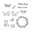
I used the June Stamp of the Month (Hello Foxy) to create this layout. This stamp set is only available in June, and is only $5 ($12.95 savings) with each $50 you purchase (before shipping and tax). Order $100, get 2...and so on! When ordering on my website, you'll be prompted to add your set(s) before checking out. I've shared some of the tips to create this layout below, as well as adding a complete list of all of the products I've used, complete with photos and links for your convenience, at the very end of this post.
Layout Tips:
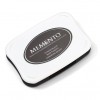
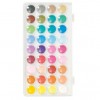
- I stamped everything with my Black Memento Pad, let it dry for a couple of minutes, then used my trusty Watercolor Paints to color and shade. I LOVE the Black Memento Pad! Once it's dry, there is no smudging when watercoloring, coloring with markers, or even colored pencils. This pad is a must have!
- When teaching watercoloring, the first tip I give my students is: LESS IS MORE! If you want that soft look, use less color and more water in your mix. As it dries, it darkens a bit. The more paint there is in your mix, the chalkier it will look. The more water, the softer it will appear.
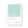
- The only other stamp pad I used was our gorgeous Sea Glass Pad. I stamped some flowers in the top strip of the layout to create my own patterned paper.
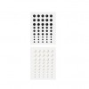
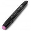
- See those fun enamel dots that match the Thistle Cardstock so well? I just used my Peony Purple Shin Han Alcohol Marker to color some White Dots. Color them right on the carrier sheet they come on and that way you can get right down to the bottom edges without the color getting on anything else. Let them dry for about 2-3 minutes, then take them off the carrier sheet and you have your own customer colored accents to add to your project.
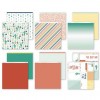
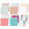
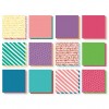
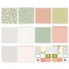
- Do you ever purchase a paper packet and then have some odds and ends left over after you've created whatever it is you bought it to create? Well, I certainly do! I used a strip of left over paper from the Prickly Pear Paper Packet (the pretty striped Sea Glass paper that goes horizontally across the middle of the layout), one of the Picture My Life cards (the orange diagonal striped one) that I had left over from Prickly Pear, and one of my left over zip strips (the polka dotted orange one) from the Hello Dreamer Paper Packet. I thought they went nicely together on this layout. Don't be afraid to mix paper packets! You'll come up with some fun combinations, and at the same time, use some of that left over paper! Win/Win!
- The "Notes" card that I used for my journaling was a bit bigger than I needed (4" x 3"). I wrote my journaling, then trimmed the unused portion of the card off (my finished journaling square was 4" x 2"), and rounded the bottom corners to match the top. Easy, peasy! Don't be afraid to think outside the box and make things work for your needs.


