pin it button

Showing posts with label Watercolor Pencils. Show all posts

Monday, September 12, 2016

Blessed Card and Artwork Tips


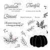
I created this 5" x 7" beauty with the September Stamp of the Month (Blessed Beyond Measure).  This stamp set is only available in September, and is yours for only $5 ($12.95 savings) with every $50 you order (before shipping and tax). Order $100, get 2...and so on.  When ordering on my website, you'll be prompted to add your set(s) before checking out.


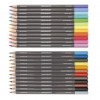
I had fun shading my pumpkin with watercolor pencils (using no water). I shared a few tips on coloring with pencils on top of a solid stamped image a little earlier this month, but I'll just post them again as a quick reminder, as well as a few more artwork tips from this card. I've included a products used list, complete with photos and links for your convenience, at the very end of this post.

Shading on Top of a Solid Stamped Image with Colored Pencils Tips:
  • You can use regular colored pencils or watercolor pencils. I love using watercolor pencils both with and without water. They are smooth and soft!
  • After stamping your image, find a color that is just darker than your image.  Scribble with that pencil on a scratch sheet of paper to make an angled tip and use that flat edge to color with (never use the point or you'll see pencil lines).
  • When coloring, go with the shape of the area you are shading. I shaded each section of the pumpkin separately, so I went back and forth like a crescent moon in my shading.
  • Push hardest with your pencil where you want the darkest color, then ease up on the pressure as you move in and want your shading to be less and less.
  • You can continue to add darker colors in the areas you want to be the darkest. I stamped my pumpkin with Goldrush ink, then used 2 colors, orangish and brownish pencils, from our watercolor pencils set to shade.
Other Tips from this card:
  • The bottom cardstock panel on this card is Pomegranate Cardstock. I stamped a tone-on-tone pattern using one of the branch stamps from the set in Pomegranate ink.  Creating your own patterned paper is a fun thing to do!  Be sure to space your stamps pretty evenly, change direction of your stamp, and don't be afraid to stamp off the edges.
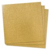
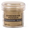
  • The word blessed is embossed in gold powder.  Be sure when you emboss over a pattern that you have stamped you either make sure your pattern is 100% dry before you add your embossing powder (or it will stick to those cut branches too), or have a tiny paint brush to brush off any powder that wants to stick where it's not supposed to before heating your embossed image.


Friday, September 9, 2016

One Card Colored Three Ways


The September National Stamping Month Special: Create Kindness is full of goodness! You can make 24 - 3" x 3" cards, 6 each of different colors and designs, including envelopes. It also comes with 8 different stamp sets to choose from, as well as a mini-stamp pad, an acrylic block and a great storage box.  It's only $46.95 (about $10 off retail price if you were to price each of the items out separately).


Here is a collage of the 8 stamp sets that come in the set:


Today, I decided to show you some of the raspberry cards using the Hello stamp set. I colored each of these cards with a different medium. The far left is with watercolor pencil (but I didn't use water, just colored them as if they were regular colored pencils), the middle is with our Shin Han alcohol markers, and the third I painted with our soft and beautiful watercolor paints. I have included a list of the products I used at the very end of this post, complete with photos and links for your convenience.

Let's talk about each color medium and a few tips on each....

1.  Watercolor Pencils:


This is one of my very favorite choices to color with. Whether I'm using them with water or without, they are smooth and beautiful, and fast.  One tip I would give you is never to color with the sharp tip. Instead, scribble for just a second on a scrap piece of paper to create a flat angle on your tip and then use that flat spot to color with. You will have so much better luck with blending and not seeing any pencil lines.

2.  Shin Han Alcohol Markers:


I love alcohol markers. They blend so beautifully!  On this card I have only used 4 colors:  Tender Pink, Cherry Pink, Pastel Green and Leaf Green.  Here are  a few tips to get great blending:
  • Color the area you want with your lighter color
  • While that is still wet, go back and highlight with your darker color
  • While that is still wet, go back over the entire area with your lighter color
3.  Watercolor Paints:


This past year watercolor painting in papercrafting has made a huge comeback.  I have had so much fun with this medium.  It's okay to go out of the lines a bit and get a little messy.  That's the look that's so "in". My card is an example of going a little bit out of the lines and still looking nice (if you don't think so, you are more than welcome to stay in the lines on yours. ;)  ).

My tip for watercolor is "less is more". It tends to dry darker than it looks when you put it on wet. You can always add more color but it's a tad bit harder to take it away.

To get this month's Create Kindness National Stamping Month Kit, click here.


Monday, September 5, 2016

Blessed Beyond Measure Layout and Colored Pencil Shading Tips


I was looking through some of my mom's photo albums last month and ran across this gem.  Are you kidding me?  This was way back in 1996. How did I not have a copy of this photo. I pulled out my trusty cell phone and snapped a photo of the photo, uploaded it to my computer, did a little editing, then printed that baby out.  Of course, it's not nearly the quality of the original (which was glued down and was not coming up to scan), but I'm so glad I have it. Since then, as I've showed this pic to some friends, I've heard this comment several times, "You guys look like an 90's sitcom family in this photo!"  I'm not sure if that's a compliment of not.  (lol).

I used the September Stamp of the Month (Blessed Beyond Measure) as my accent on this layout (the title and the pumpkin) and used papers from the new Enchantment Fundamentals pack for most of the background and the little flags along the side of the photo.  I've included a full list of the products I used, complete with photos and links for your convenience, at the end of this post.


Remember that this stamp set is only available in September and is yours for only $5 ($12.95 savings) with every $50 you order. Order $100, get 2...and so on. When ordering on my website, you'll be prompted to add your set(s) before checking out.

Here are a few close ups of the layout.  The first shows the flags I used down the side of my photo.  along with papers from the Enchantment Fundamentals pack, I also used some of the stamps from the Stamp of the Month to stamp tone-on-tone designs on some cardstock.


In this photo, you can see the close up of the pumpkin, which I stamped in Goldrush ink then used my watercolor pencils (without water) to shade on top.  I will give you a little detailed photo of how to do that below.  Another fun detail this photo shows is that on the "word search" paper from the Enchantment Fundamentals pack, there really are fun words to find and circle, which is a nice touch on this layout.  I just chose a few words that I thought went with my layout and circled them with my journaling pen.


Colored pencil shading on solid stamping:


Steps to shading on solid stamped images with colored pencils:

1. Stamp your solid stamp. In this case that is the pumpkin design. I stamped it in Goldrush ink (first pumpkin).

2.  Pick a colored pencil just slightly darker than the base ink color and shade.

A few tips:
  • take your pencil on a scratch piece of paper and rub it at an angle. This will make a nice angled flat tip on your pencil. This will make your shading much smoother than using a point to color.
  • start at the place you want to be the darkest on your shading and press the hardest with your pencil. Go back and forth along the length of what you are shading.  As you move in, put a little less pressure on your pencil so the shading gets lighter and lighter and blends with the base ink color.
3.  Once you are happy with your first pencil shading, feel free to find a darker color and do a little more shading at the places you want to be the very darkest. I used 2 colors of pencils on this pumpkin.

Have fun stamping and shading!


LinkWithin

Related Posts with Thumbnails